

In case you missed it, we’ve had a little rebrand - Empty Studios is now Artlink & Co. Same team, same catalogue, new name!
And fittingly, this month’s edit has a shift of its own: neutral.
Neutral used to mean safe, the palette you chose when you didn’t want to make too much of a statement. That’s changing.
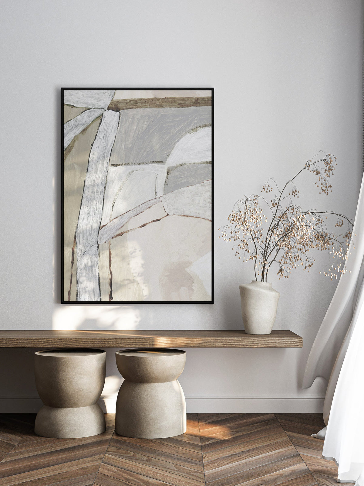
Today’s neutrals are layered, textural and considered. Warm stone sits against cool linen. Charcoal replaces black. Sand replaces white. Texture and tone do the work that colour once did.
Nothing here is loud, but nothing feels flat either.
This approach also makes sense beyond the current trend cycle. As clients look for interiors with longevity, softer palettes offer flexibility across different spaces, materials and briefs. They support a scheme rather than compete with it, and have a way of feeling relevant long after a stronger colour trend has passed.
That’s the thread running through this month’s edit: abstract works where tone and texture take centre stage.
Soft neutrals, layered surfaces and subtle shifts in colour create depth and movement without overwhelming a space. Some are quiet and minimal, others more expressive, but all share the same restrained approach to colour.
Neutral doesn’t have to mean minimal. It can be textured, expressive and full of depth.


